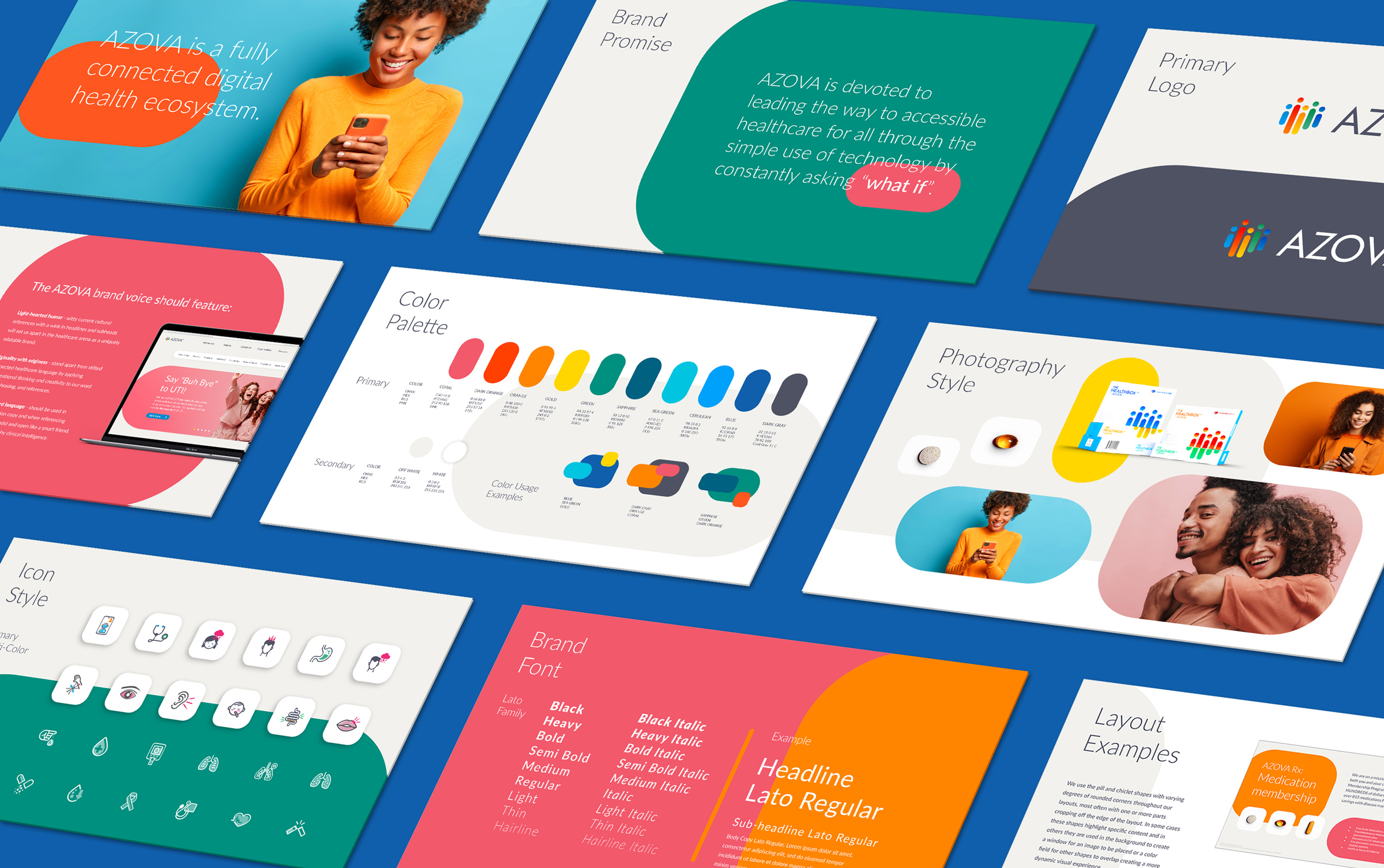
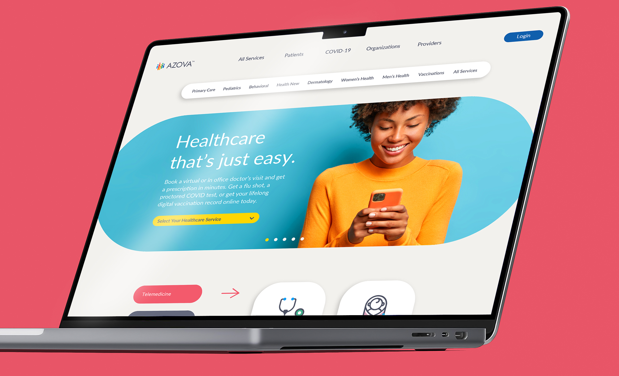
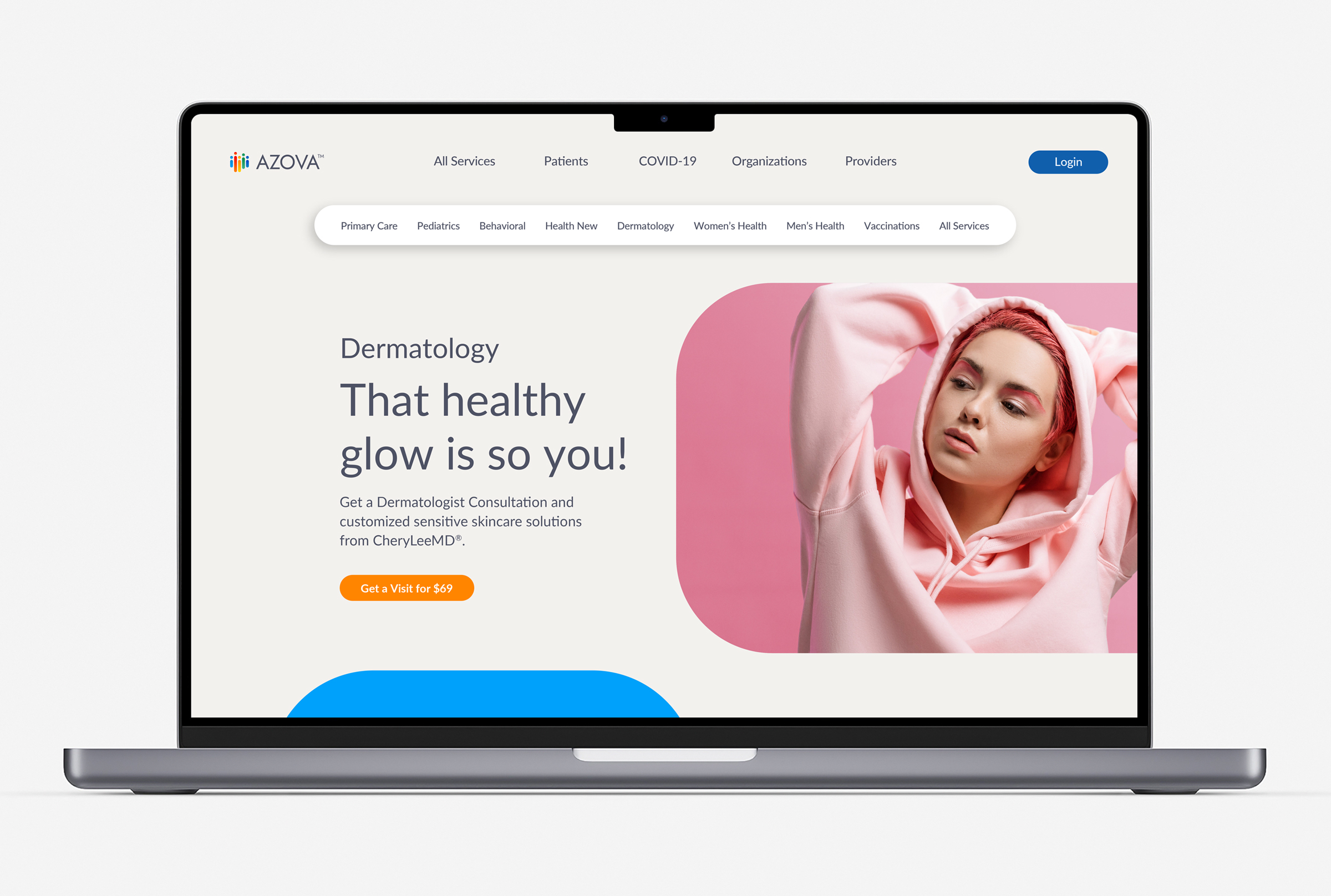
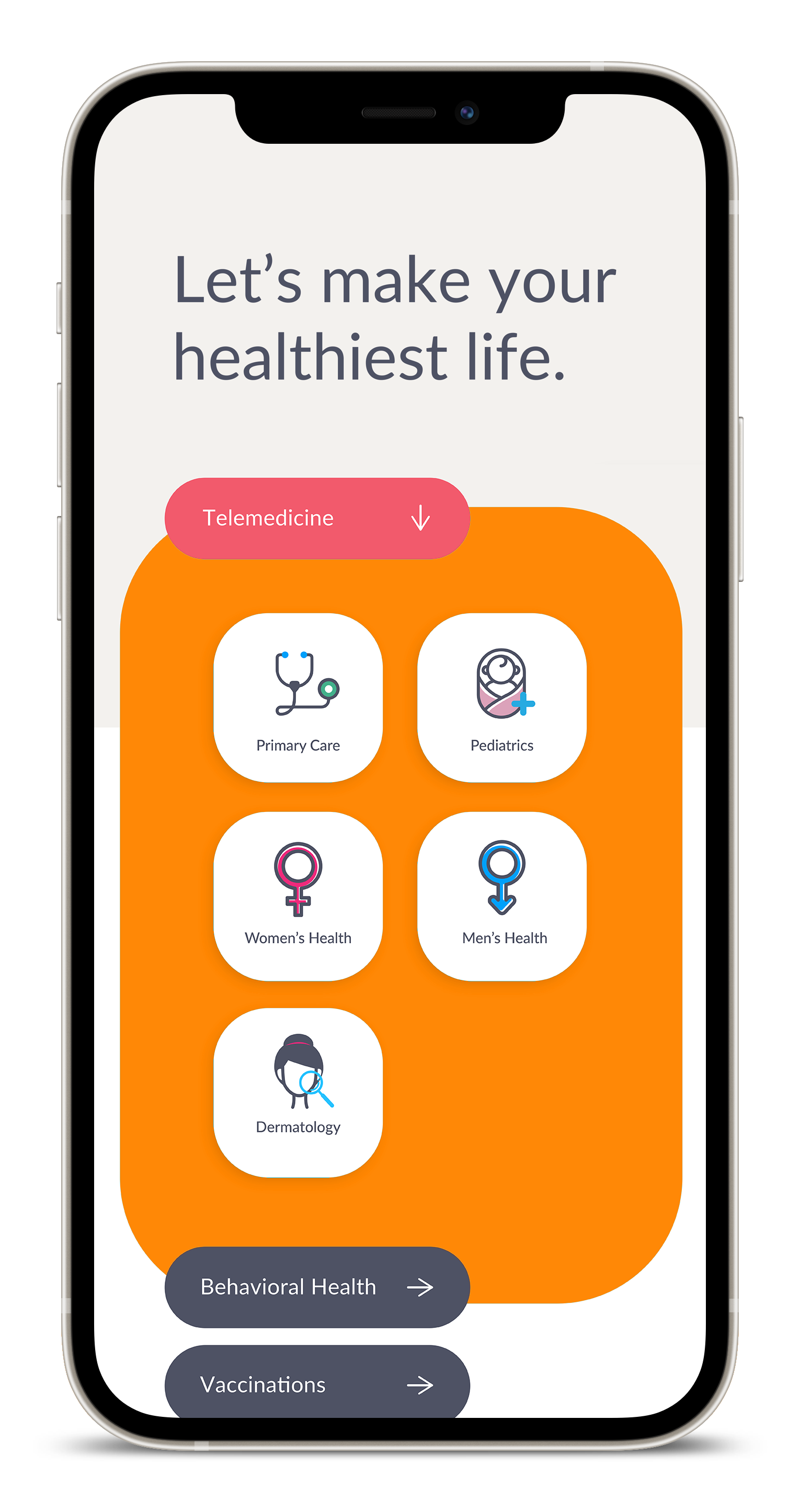
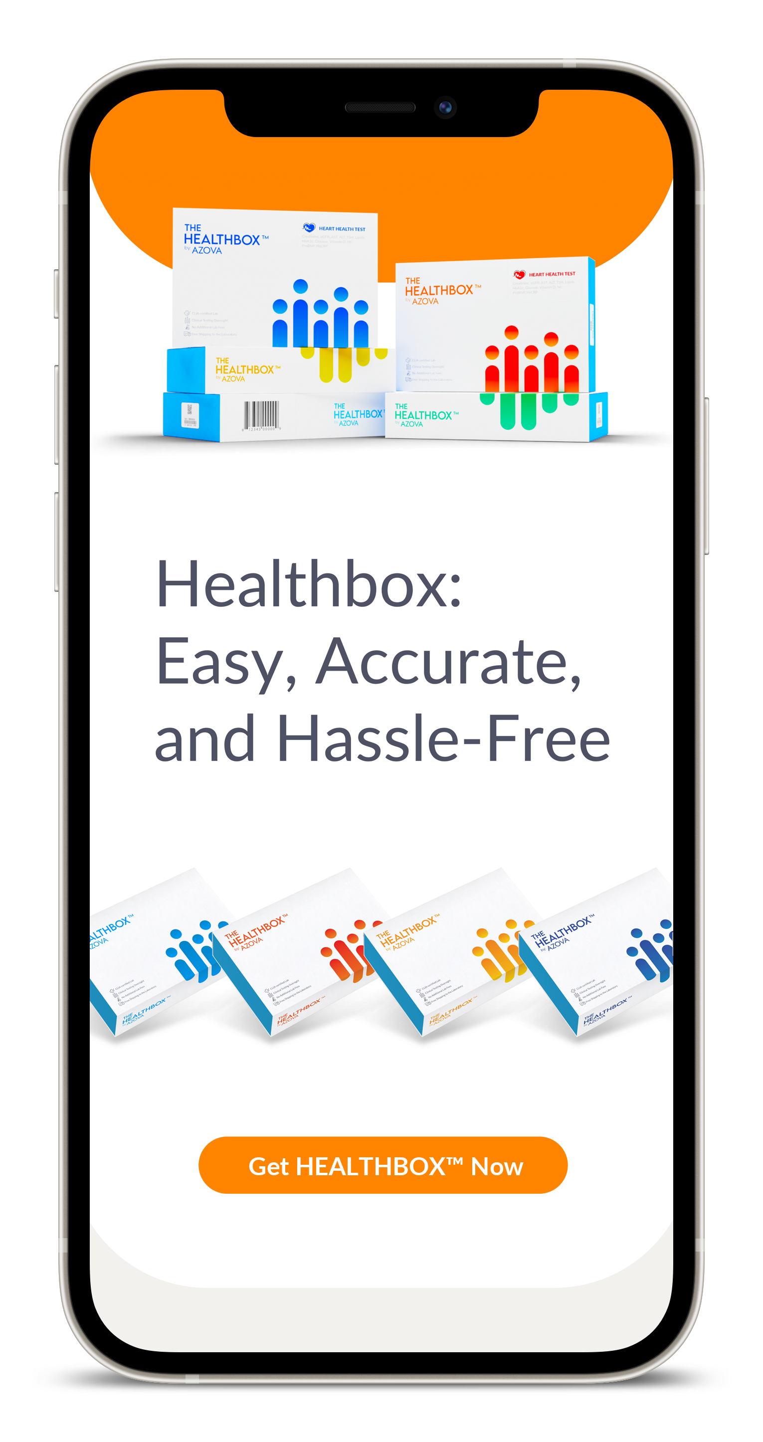
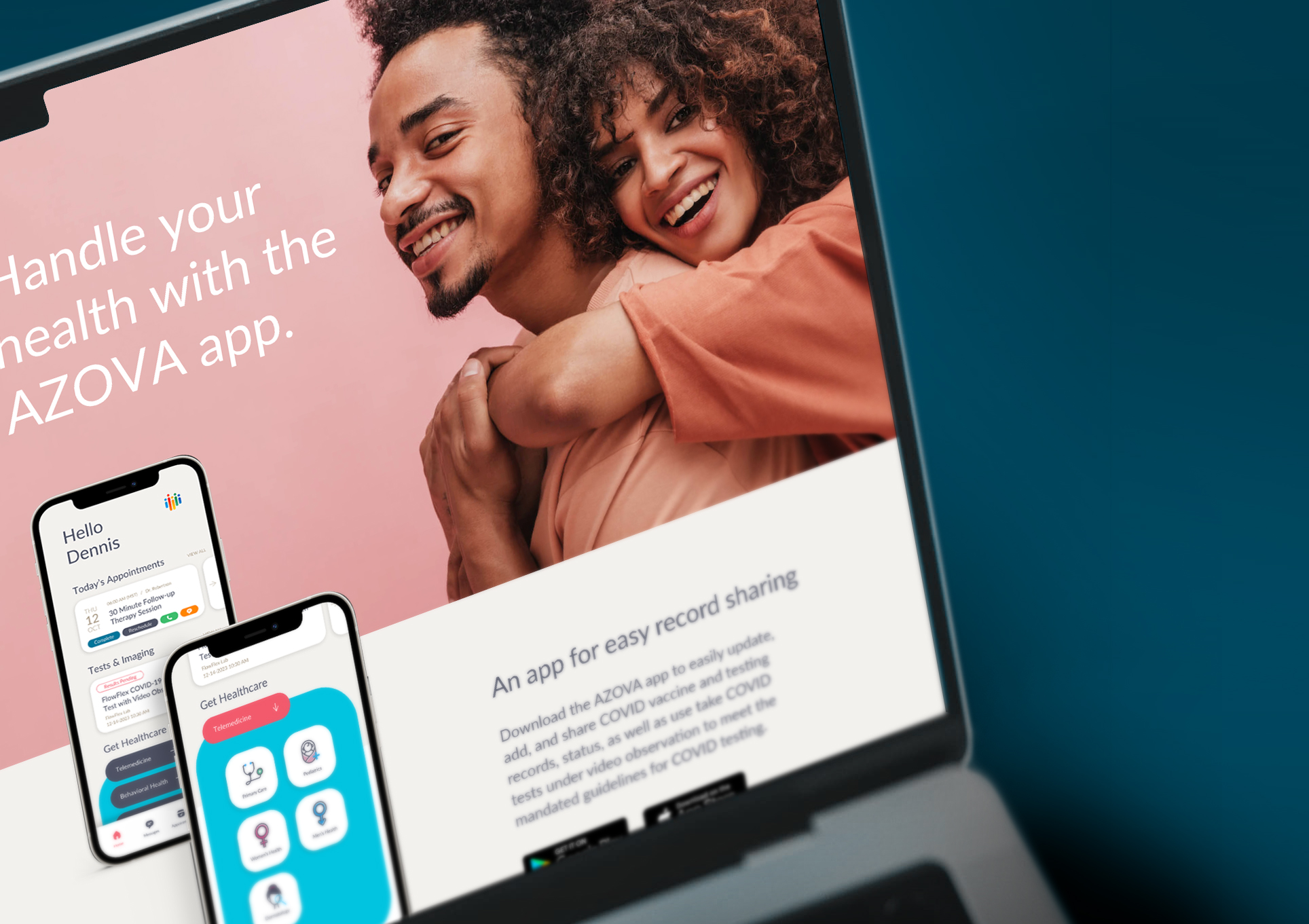
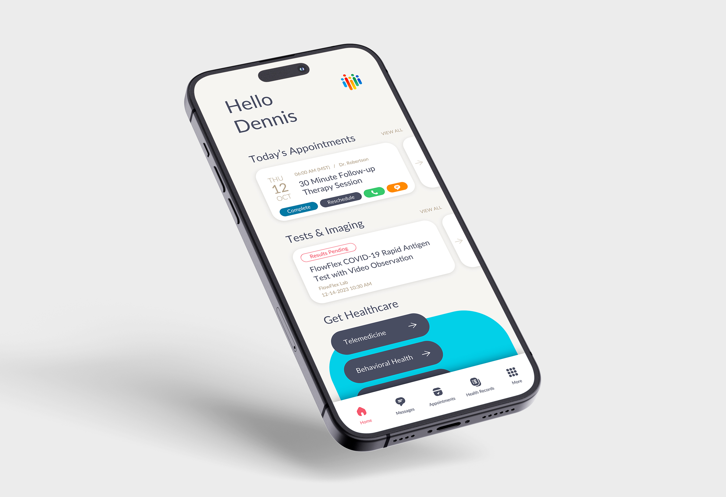
Lorem ipsum dolor sit amet, con sectetur adipiscing elit, sed do eiusmod tempor.

...>>>

Intro Headline

AVOZA, an online telehealth provider, asked VehicleSF to swoop in and refresh their brand. After doing some investigating into their current brand guidelines and visual approach we simplified and brought a new exuberance to their visual expression. We focused on specific key elements which helped us build a well rounded but trimmed down guide that was nimble and easy to use that whole company could quickly embrace.

Website

The website was core to our initial research and brand development. It is a major entry point for consumers of a brand built around online healthcare. While focusing on a few key sections of the website we were able to start building a language we could use throughout the program. By harnessing the rounded shapes and bold colors that were part of the existing brand we simplified and modernized the visual experience with a more ownable brand language .

APP

Being that the app is extremely important to the user experience we used our new language and updated key moments giving it a more friendly and modern feel. The app's content is deep and in many cases hard to understand but with our more simplified approach we helped AZOVA control some of that clutter and give the user something they will want to actually use.

Sub-Head

With the team feeling we stress-tested our new design language and had an updated brand guidelines formulating we pushed our refreshed look to other elements, like Google presentation decks, social assets, emails, etc.

Project Scope

Research & Insights
Strategy & Positioning
Retail Shops & POS
Creative / Art Direction